Mat Maitland on his limited-edition love letter to magazine art

When digital art was still finding its feet in the early 2000s, Mat Maitland was already perfecting his own visual language. His surreal collages mix high fashion with pop culture, future with past, and luxury with street in ways that shouldn’t work — but absolutely do. He’s bent reality for everyone from avant-garde magazines to Michael Jackson, creating visual fever dreams that feel both timeless and thoroughly modern.
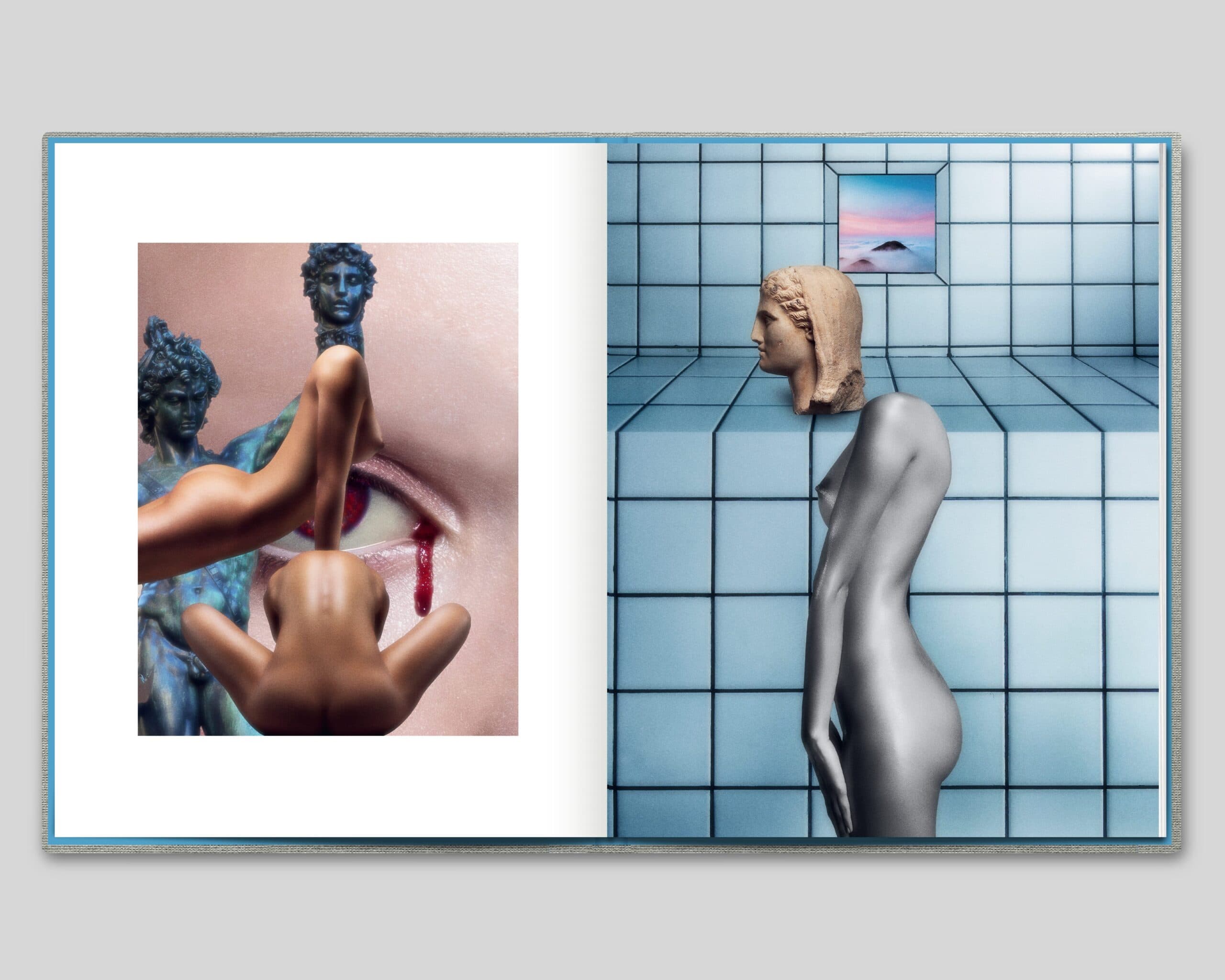
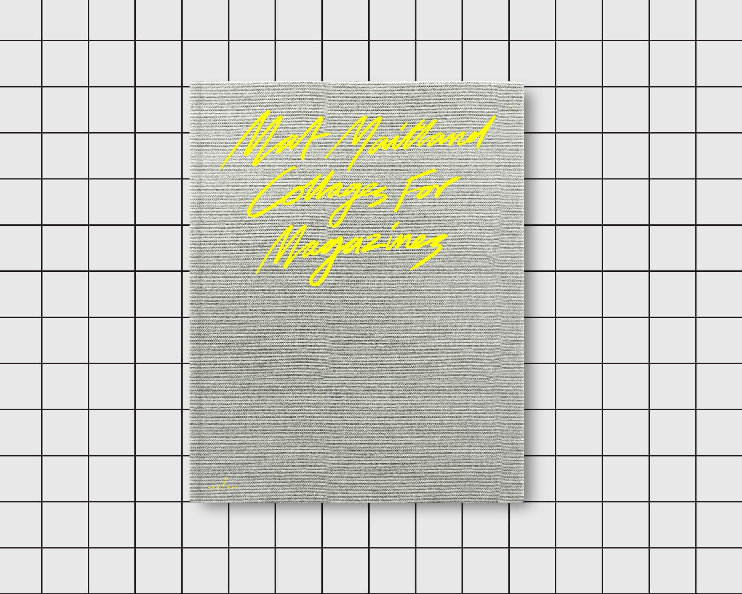
His new book “Collages for Magazines” is destined to be one of those sought-after tomes you’ll spot on the shelves of Dover Street Market. Limited to 1,000 copies, with yellow foil handwriting on silver cloth, it’s already ticking all the boxes for collector catnip. Inside, fifteen years of boundary-breaking image-making unfolds across fashion editorials and music industry collaborations — think Prince album covers meets Japanese pop art, all filtered through a lens that’s uniquely Maitland. Here, he opens up about his creative process, why a Coca-Cola can hold as much cultural weight as a Cartier bracelet, and how controlled accidents keep his work alive.
Amber Rawlings: There’s such an intriguing tension between luxury fashion and pop culture in your work — was this intersection something you deliberately sought out, or did it emerge naturally?
Mat Maitland: Fashion often flirts with elitism, presenting itself as an attainable dream while remaining just out of reach. Pop art, however, operates on an entirely different frequency — it takes the ordinary, the everyday, and magnifies it into something extraordinary, larger than life. I’ve always been fascinated by this tension. It’s not something I consciously strive for in my work, but it inevitably seeps in, shaped by my deep-rooted love of pop art and pop culture. In my images, there are no boundaries dictating what can coexist. A Coca-Cola can holds as much cultural weight as a Cartier bracelet in my eyes — there’s a kind of democracy in that, and I find it beautifully liberating.
AR: Your collages seem to exist in this fascinating space between nostalgia and future-vision. What draws you to this particular temporal mashup?
MM: My work flows seamlessly across different timelines because my collages allow me to pull elements from any era. The future and the past are equally enigmatic to me — one has yet to unfold, while the other has already slipped away. Both remain just beyond my grasp, shrouded in the realm of imagination. This interplay of temporal mystery is what breathes life into my creations.

AR: Having worked with houses like Hermès and Louis Vuitton while maintaining such a distinctive style — how do you balance brand requirements with your own creative vision?
MM: I always ground my work in a theme or a set of objects, but my stylistic approach to construction remains consistent. When collaborating with a fashion brand, I align with the codes and references tied to their collection or narrative. Even so, this framework leaves me with complete creative freedom — freedom to craft unexpected combinations, weave abstracted stories, and make deliberate choices about colour and composition. It’s a balance of honouring the brand’s vision while preserving my own artistic voice.
AR: What was the moment that made you realise these magazine pieces needed to exist together in book form? Did the collection reveal new patterns or themes?
MM: I’ve been approached about doing books before, but my work spans so many disciplines – creative director, designer, visual artist, and filmmaker – that I could never settle on how to bring it all together. Including everything felt overwhelming, almost like drawing a line under my career, which I wasn’t ready for. Then I had the idea for an exhibition titled Collages For Magazines, and it struck me as the perfect concept for a book. Editorial work rarely gets viewed as a cohesive body — it’s scattered across different magazines over time. A book would give that work a sense of permanence, which I find appealing. When Art Paper Editions expressed interest in publishing it, the timing felt right to make it happen.
AR: Your work seems perfectly suited to our current digital age, yet there’s something deeply analog about it too. What do you think about this duality?
MM: My work may be purely digital, but the process feels almost analogue — slow, deliberate, like layering brushstrokes or piecing together a puzzle. Each image is carefully built, with the goal of feeling human and real, even as it veers into the surreal and seamless. The way I handle colour and texture is crucial too, grading the tones and adding grain until everything feels just right. But honestly, it’s not something I overthink. It’s an intuitive process, more instinct than strategy, and that’s where the magic happens.

AR: Could you talk about how creating visuals for musicians like Prince and Michael Jackson might have influenced your magazine work, or vice versa?
MM: When I create images, whether for magazines or other projects, my approach is always the same: it’s about alchemy. I start with a collection of existing materials – images, elements, fragments – and then reimagine and re-contextualize them to form something entirely new. There’s a transformative process in how these pieces come together, often led by intuition and chance. I’ll gather images that resonate with the theme I’m exploring, and they seem to suggest their own narrative, guiding me on how to use them. Of course, sometimes there’s a specific idea I need to communicate. Take the Xscape album cover for Michael Jackson. The title itself suggested magic and mystery, which influenced my thinking. The process began with an image provided by The Estate — a striking portrait with strong eye contact. However, it also featured a pointing gesture that I chose not to include, which ultimately informed how I treated and transformed the image. For me, unplanned or controlled accidents play a significant role. Unlike a photographer, who might start with a vision and then execute it, I often begin with found images and work backward, piecing things together without knowing exactly where I’ll land. It’s this unpredictability that keeps the process alive and exciting.
AR: This book feels like it could become one of those sought-after art publications. Did you think about its potential life in specialized bookstores while developing it?
MM: Absolutely, especially when it came to the cover design, which Jurgen (from Art Paper Editions) and I gave a lot of thought to. The title is intentionally concise, so we wanted the cover to feel just as immediate and impactful. We used my handwriting in yellow foil block against silver book cloth, creating a design that’s both striking and layered with meaning. The foil adds a playful, pop element, while the silver book cloth conveys a sense of futurism paired with a touch of timeless classicism — both recurring themes in my work. With only 1,000 copies printed, it’s truly a collector’s edition. Once they’re gone, they’re gone, which adds to the specialness of the project. It’s a physical piece that reflects the same care and thoughtfulness that goes into every detail of my work.

AR: Your work seems to reference everything from surrealism to pop art to album covers. What are some of your less obvious influences?
MM: It’s hard to define exactly. My process feels like drawing from a reservoir of visual fragments stored in my mind — bits of films, fashion, photography, music, and art that come to me in the same way a fleeting scent or a wave of nostalgia might. It’s intangible, something you can’t quite grasp or pin down. I do have a deep affection for Japanese visual culture, and I think that often finds its way into my work. Japan still feels like an exotic, alternative visual universe, especially when viewed from a Western perspective. It reminds me of how American culture felt in the mid-20th century — seductive, fresh, and endlessly fascinating. Of course, the digital age has flattened those borders, making everything more accessible and interconnected. But even in that context, Japan continues to hold a certain mystique, offering a kind of inspiration that feels both timeless and distinct.
AR: Looking back over 15 years of creating these collages, how has your relationship with digital tools and image-making evolved?
MM: Surprisingly, little has changed in my technique over the years — it’s remained quite consistent. While I find technology fascinating, I see it as a paradox: it’s both one of the most important things in the world and, at the same time, one of the least. I’m a strong believer in the value of limitations, so I prefer to keep my process simple. For me, tools exist to help realise my vision, not to dictate it. That said, I’m always intrigued by new developments that can enhance or inspire new ways of working. AI tools are exciting as assistants in the creative process — but never as drivers. It’s the artist’s intent that matters most, and I see technology as just one part of the toolkit, not the source of the creativity itself.
You can purchase Collages for Magazines here.


